
OCEANSIDE — The Oceanside Unified School District has unveiled a new logo, scrapping the lighthouse image for a simple letter “O” with different shades of blue and a pop of yellow.
Back in July, the school board approved work on a new logo to replace the current one, which features a lighthouse shining over the district’s name. The board hired Alpha Graphics, an Oceanside-based graphic design company, who also partnered with Try J Advertising to create the new logo.
The school district sent out surveys to its families asking their opinions on what they would like to see in a new logo. Communications Director Donald Bendz said they received 120 responses.
“Many people spoke of the district’s diversity and the importance of being a coastal community,” Bendz said at the Dec. 14 board meeting.
Bendz also noted that a lot of participants wanted to move away from using the lighthouse symbolism and find something new to represent the district.
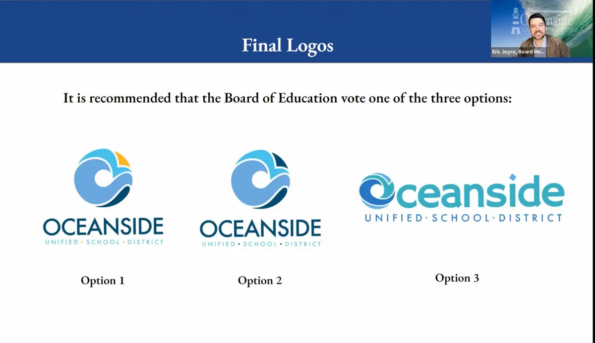
A 10-person committee was then formed with two high school students, five staff members and three community members to guide the design team on the new logo. Both met several times before the design team presented five, final options to the committee, which voted on its top three choices to be considered by the board.
Out of the three options, the board unanimously voted for the first option, which features an “O” made of what appears to be waves with different shades of blue and a shot of yellow. Though left up to the imagination, a common interpretation of this O symbol recognizes the waves, the sky and the sun as yellow. The school district’s name is then presented underneath the O.
“What’s great about this option is that it allows each viewer to have their own experience and interpretation of what they see,” Bendz said.
The design team had considered using the Oceanside Pier as part of the new logo, but the committee determined that it wasn’t a strong enough symbol for the school district. The committee and design team also wanted to avoid including a symbol of a structure that is not managed by the district, Bendz noted.
The second logo option considered was almost identical to the first option except for the O symbol only had different shades of blue and no yellow, and the third option was the district’s full name with a similar O symbol design replacing the O in Oceanside.
Trustee Raquel Alvarez, newly elected as the board’s vice president, said she preferred option one because of how its range of colors highlights the district’s diversity. She also liked how the waves in the O symbol recognize the district as a coastal community.
Fellow Trustee Eric Joyce thought the contrasting colors of the first option would look better on stickers, apparel and any other items that would be used to promote the district with the new logo, though he would have preferred even bolder colors.
For Trustee Eleanor Evans, the first option carries the most symbolism out of all. She saw the yellow as sand and noted the appearance of a seagull flying over the waves in the symbol.
“I want to see our students fly high like the seagull and eliminate the brain drain that happens,” she said.
Evans also said the O’s circular shape represents the district’s inclusiveness.
Trustee Mike Blessing, the newly elected board clerk, said he originally preferred the third option but was willing to get behind option one given its popularity.
“I can’t wait to see it behind me in my Zoom,” said Trustee Stacy Begin, who was re-elected to lead the board as its president for another year at the same meeting.
The new logo has already taken over the district’s website.